
My role: UX/UI Designer. On this project I was working alone.
Duration: June - July 2021.
Outcome: High fidelity prototype with a high user satisfaction rate and effective usability performance.
Market Research
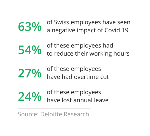
Scope: Swiss citizens have been massively affected by the COVID-19 crisis. Not everyone has a stable income and it becomes difficult to control your expenses and to understand what you would have on your account at the end of the month.
Problems: The central issue arises from the complexity of tracking expenses, resulting from diverse unscheduled payments, unforeseen expenditures, spontaneous purchases, an unstable economic environment and workforce reductions.
UX Research
The key aspects I aimed to investigate include:
1. Trends in budgeting practices in Switzerland
2. Examination of how Swiss citizens manage their income and expenses
3. Evaluation of budgeting's efficacy in mitigating unforeseen costs
4. Creation of a user-friendly mobile app
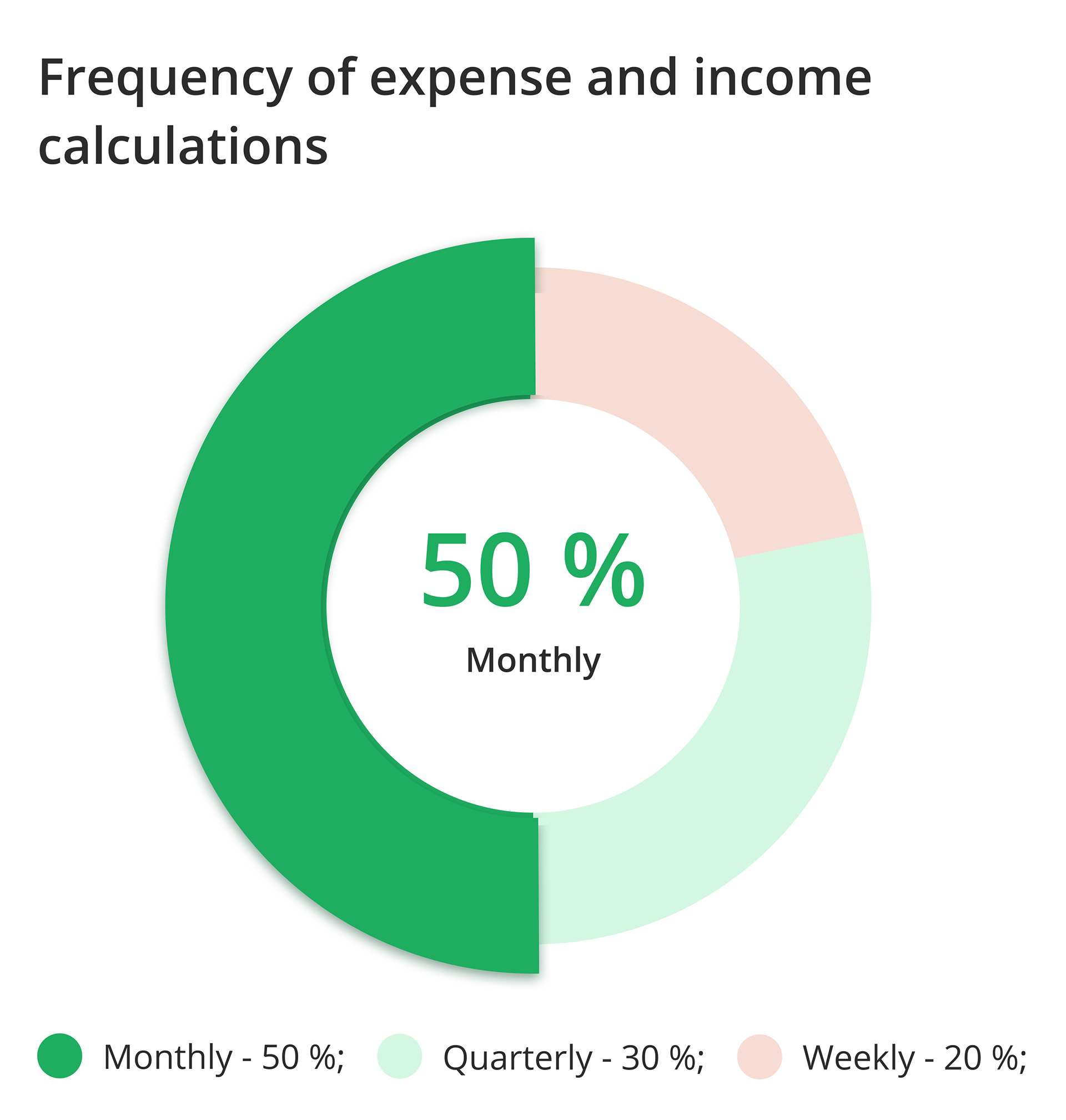
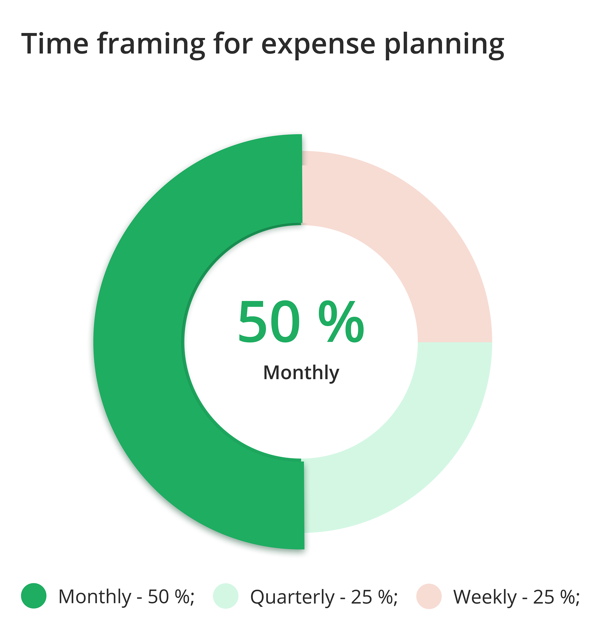
Here are some visual representations of insights gathered from user interviews
Ideation
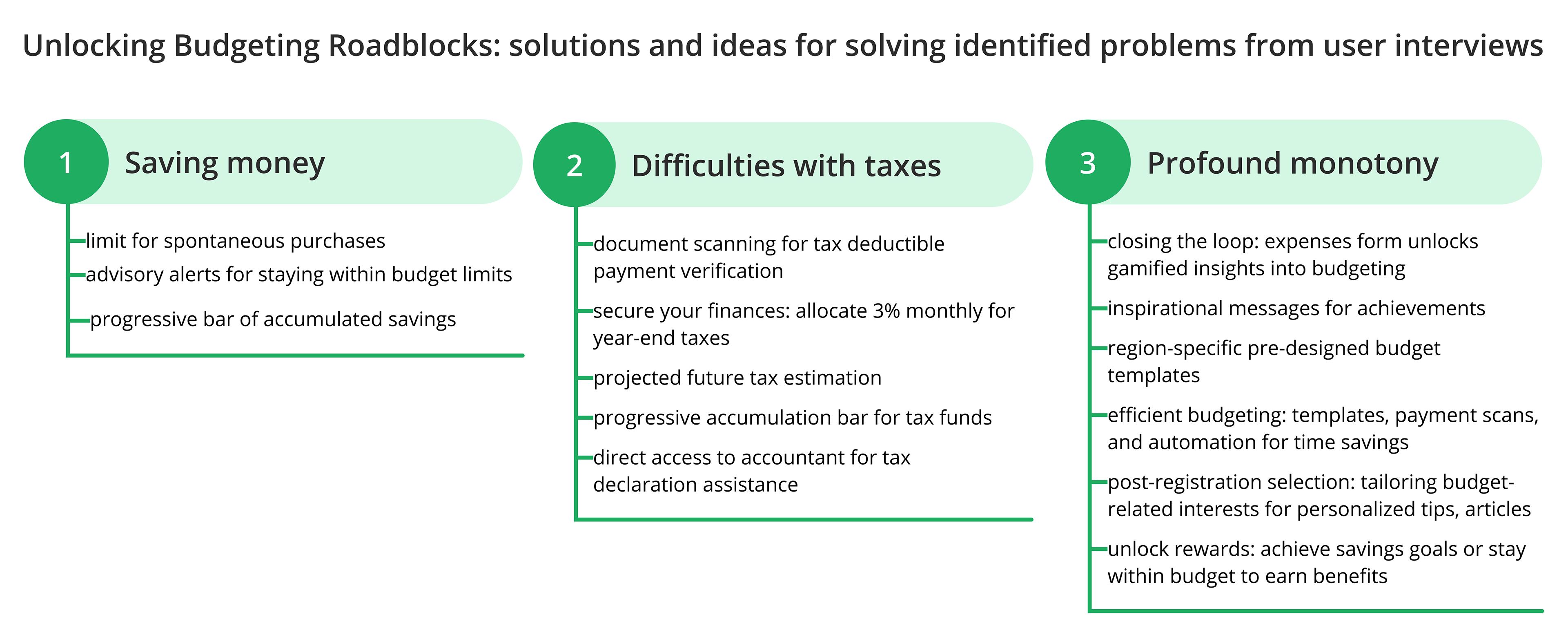
During my analysis of user interview data, I encountered challenges. Notably, 70% of respondents expressed no need for a budgeting app, yet 100% reported dissatisfaction with their family's budgeting methods. Each individual faced difficulties in expense management. This insight revealed discontent with existing options, prompting me to delve deeper into their specific concerns. Employing diverse techniques, I identified three core pain points during ideation: saving money, difficulties with taxes, and profound monotony.
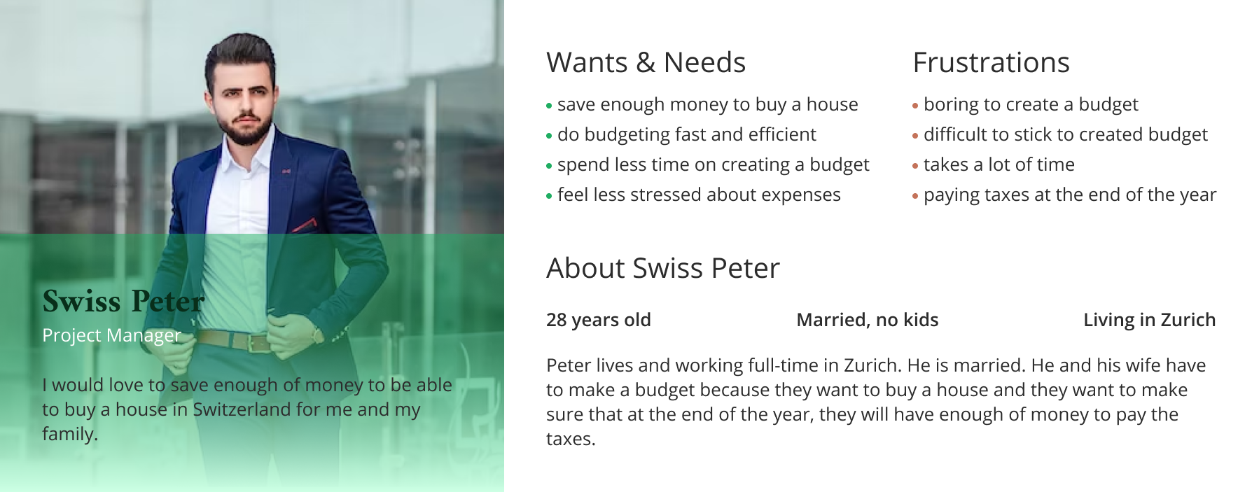
Persona
Formulating a User (Proto) Persona emerged as a valuable strategy, drawing from insights gained in prior research. This approach played an important role in directing my focus towards essential elements and acted as a visual reflection to drive my decision-making process. By bringing these hypothetical user characteristics to life, I could better envision their needs, preferences, and challenges, ultimately leading to more informed and inspired choices throughout the project.
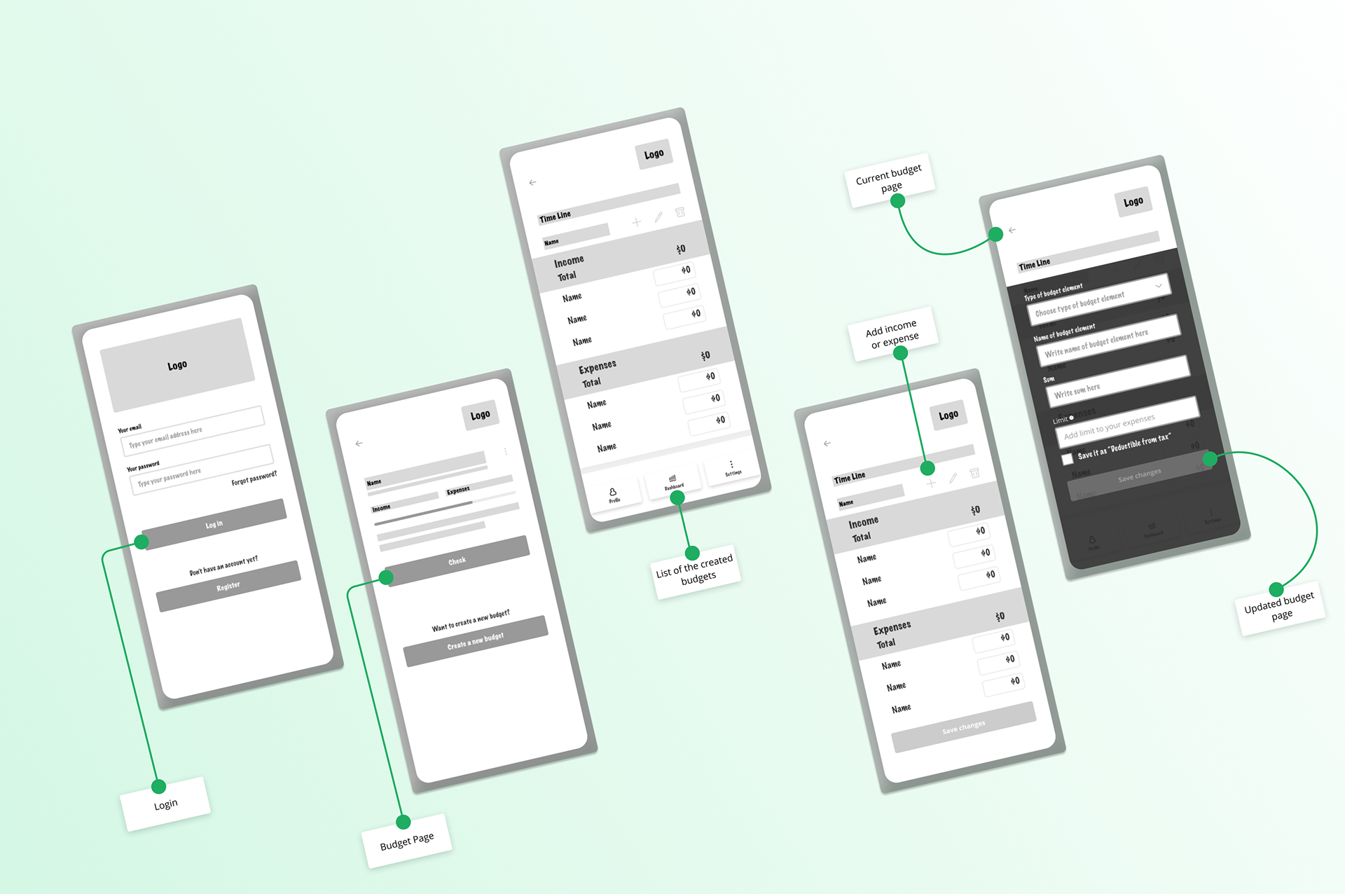
Low - Fidelity Wireframes
Upon refining and selecting the initial features for implementation, I moved to low-fidelity prototype. This phase aimed to visualise the integration of these features into phone screens. The choice of which features to prioritise decided on a Value vs. Complexity matrix assessment.
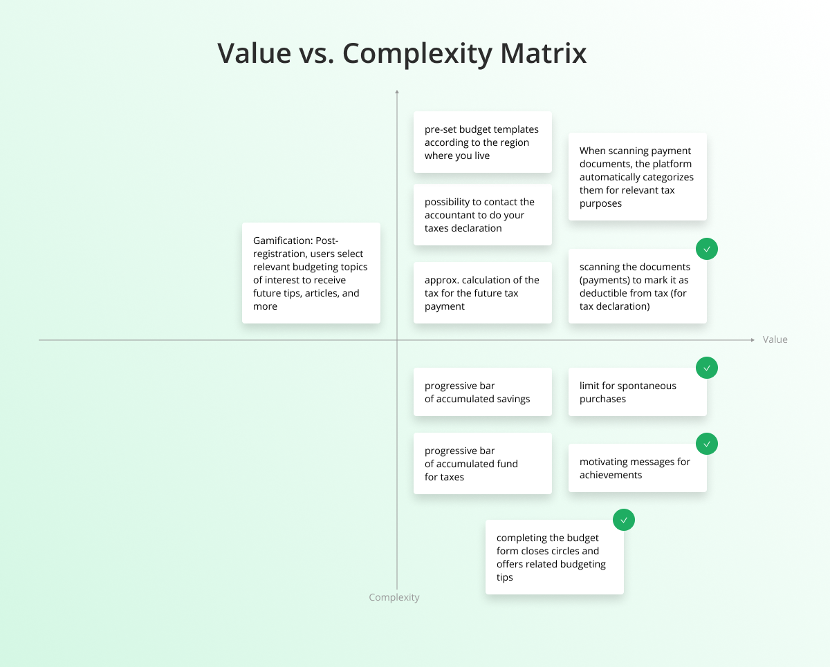
Consequently, the following solutions were devised:
1. Implementing a limit on spontaneous purchases to enhance adherence to the budget and prevent unnecessary expenditure.
2. Incorporating encouraging messages upon successful following the budget to florish positive emotions.
3. Enabling document scanning (or expense addition) with the ability to identify and categorise them for future tax declarations.
4. Introducing a holistic approach to budgeting by closing various financial loops through budget form completion, accompanied by tips on related budgeting aspects (gamification), fostering a habit-building such as fitness apps.
Usability Testing
Upon conducting multiple remote usability tests, I identified specific areas where users encountered challenges while interacting with the platform:
1. Lack of different viewing options (monthly, yearly, etc).
2. Uncertainty about how to initiate payment scanning.
3. Difficulty in accessing commonly used categories.
4. Inability to assign expenses to specific budgets.
5. Confusion around the purpose of the plus button.
In response to user feedback, I introduced design modifications, ensuring seamless and logical functionality prior to advancing to the high fidelity prototype stage.
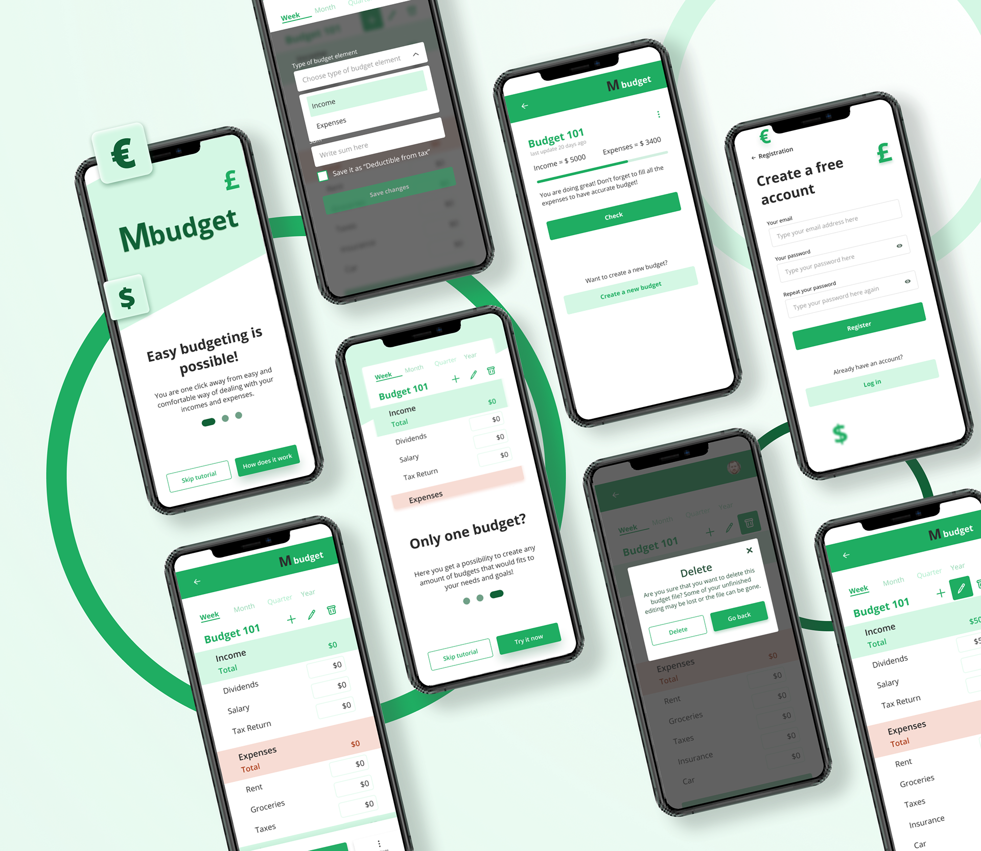
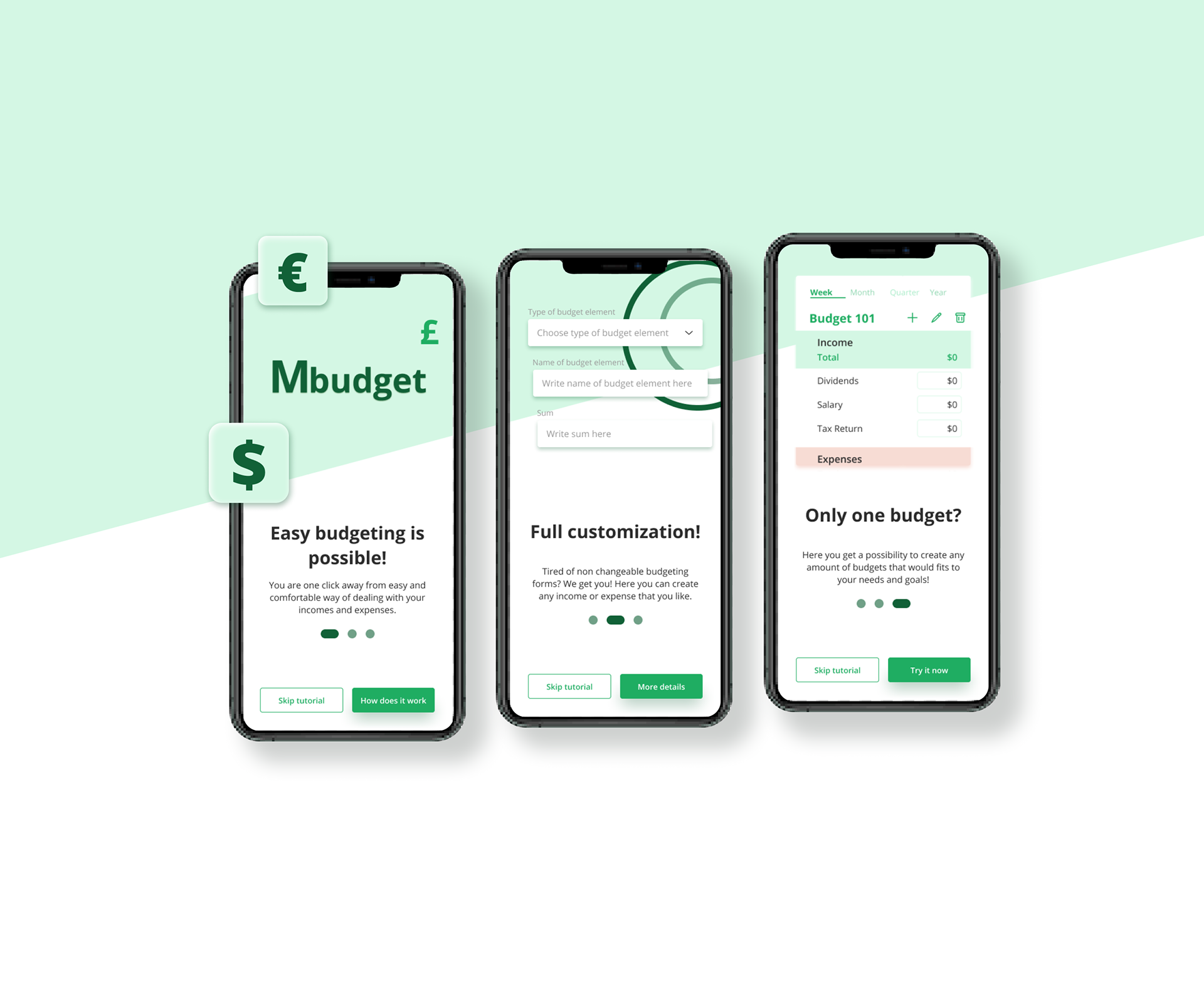
High - Fidelity Prototype
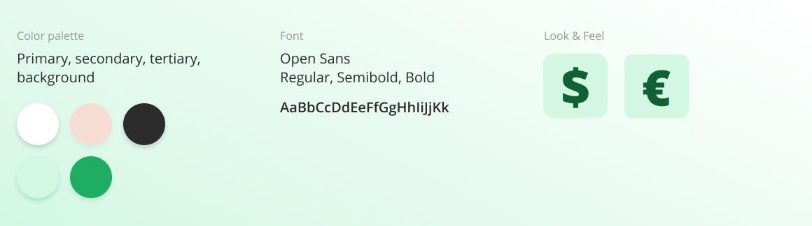
Following usability test feedback on low fidelity wireframes, I adapted designs and transitioned to crafting a high fidelity prototype. This stage involved thorough research into color palettes, font styles, and brand identity.
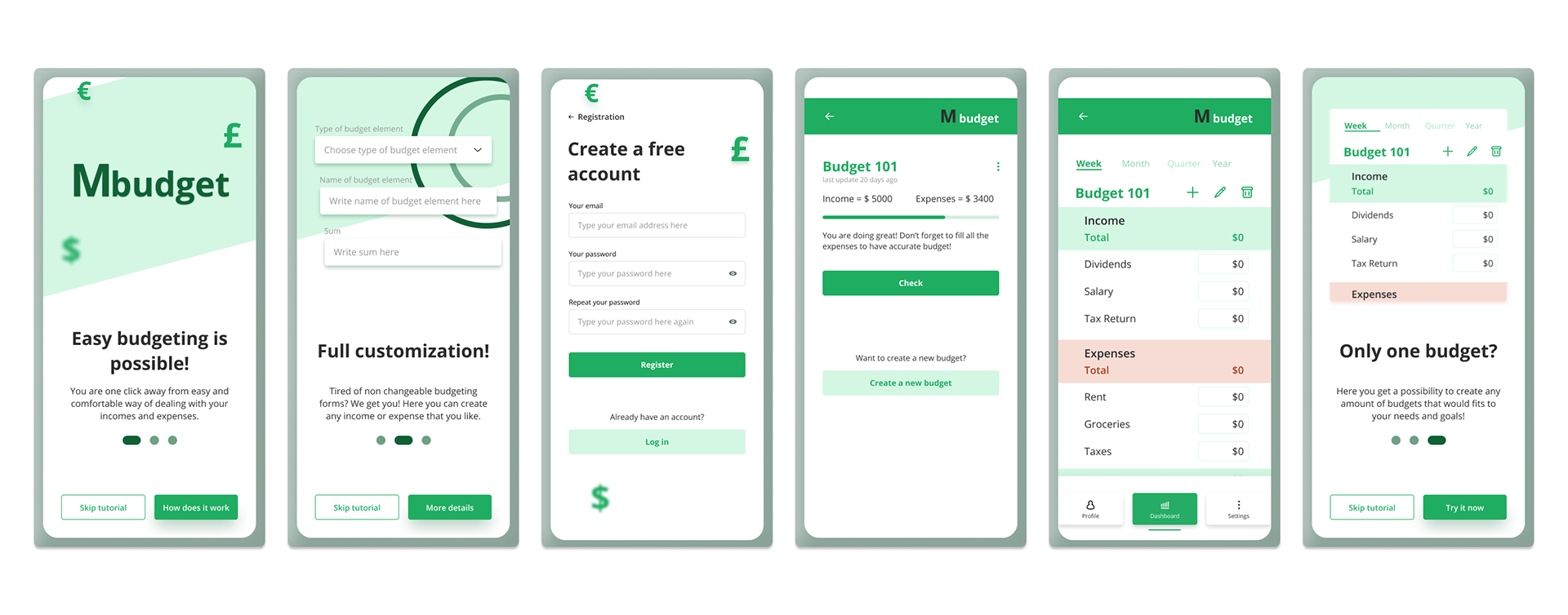
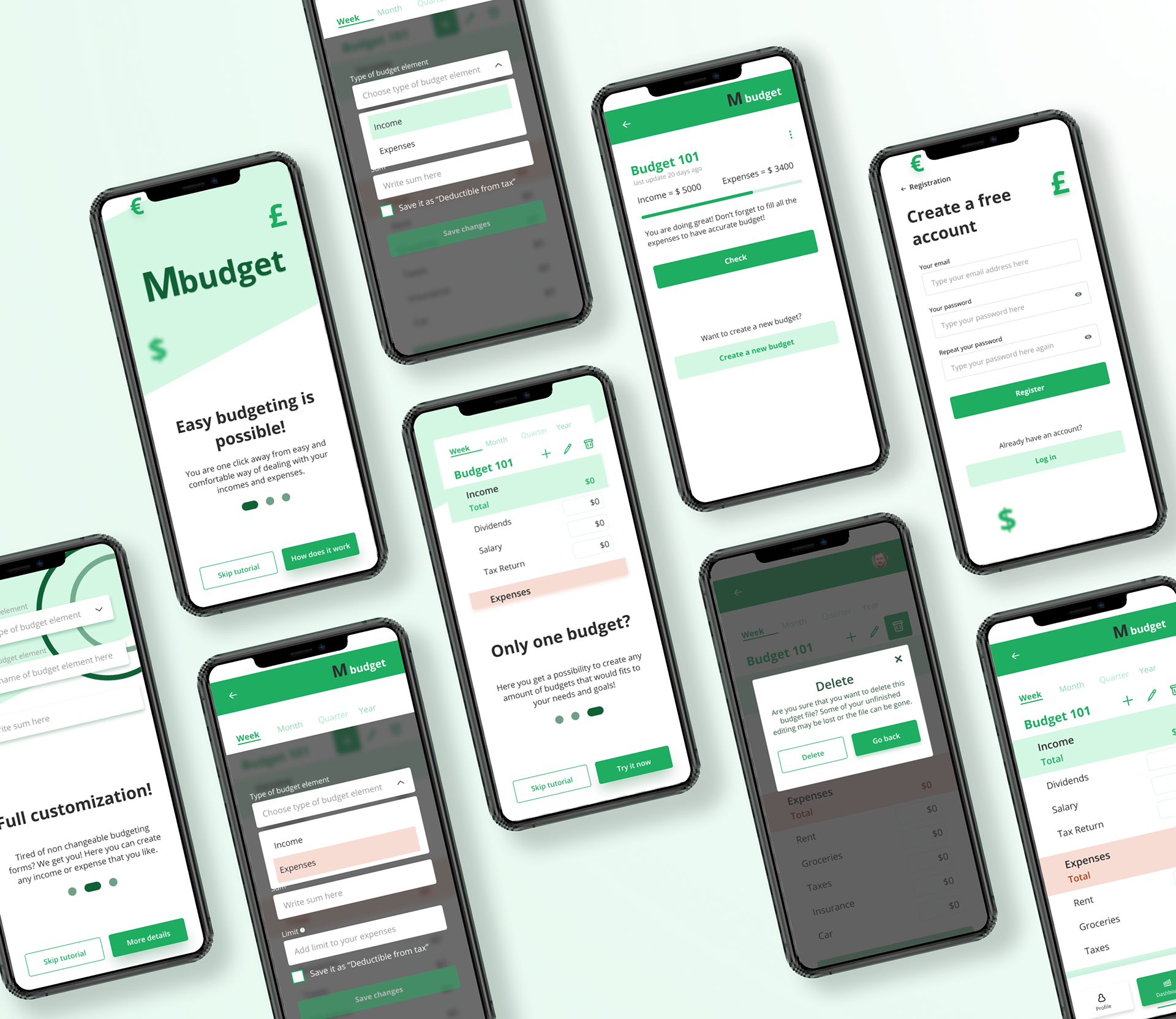
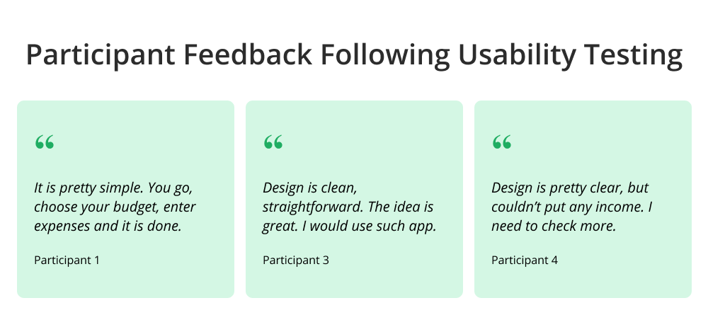
Upon finalising the high fidelity prototype, I conducted additional usability testing. Users were tasked with creating a new budget, setting an expense limit, and reviewing the modified budget. While users effectively created new budgets and added expenses, challenges occurred in establishing expenditure limits. It indicates the need for further refinement and enhancement in this specific process.
Summary
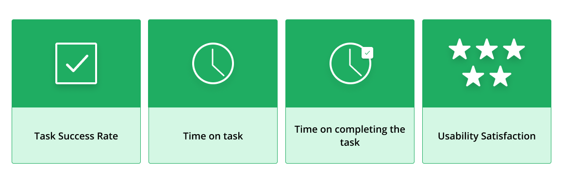
Metrics that I would use to evaluate the design: I believe that using combination of different metrics would bring holistic understanding of design performance, user behaviour and potential areas of improvements. For this project I would use such metrics as:
1. Task Success Rate - it would help to measure the percentage of users who can successfully create a budget, add limits to expenses, and mark items as tax-deductible without major issues. This would provide insight into how intuitive and user-friendly the design is.
2. Time on task - it would help to measure the real time that users spend on doing main action within the app. This would provide insight into usability issues if users spend longer time than expected.
3. Time on completing the task - it would provide an information into the real time that users spend on completing various tasks within the app. This would demonstrate if the app is easy to use and assess the efficiency of the application.
4. Usability Satisfaction - it would provide an insight into users' overall perception and appreciation of the app by using system usability scale questionnaire.
I believe that there are other possible metrics that are possible to use, but at first I would concentrate on these ones, because I think that would bring the most value at the beginning. Further I would also use A/B Testing with the screens that would demonstrate low- rate performance.
Personal story behind: This project took shape as I was actively involved in the UX Nanodegree program at Udacity. Beyond that, I embarked on a redesign project following my completion of various UI courses at Hype4 Academy. These experiences gave me a better understanding of visual hierarchy, the value of grid systems, and the importance of design consistency. Through interviews and testing sessions, I gained the skills to effectively evaluate design elements, user flows, and areas for improvement.
Thank you for exploring my project! If you're curious to see more of my work, head over to the "Work" section. And if you have any questions or just want to chat, feel free to reach out – I'd love to hear from you!
Tschuss, ciao, au revoir, ade!